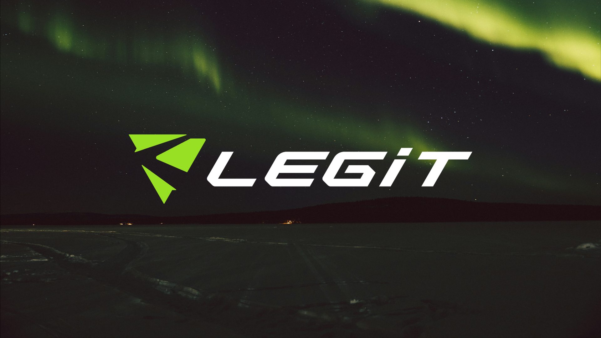
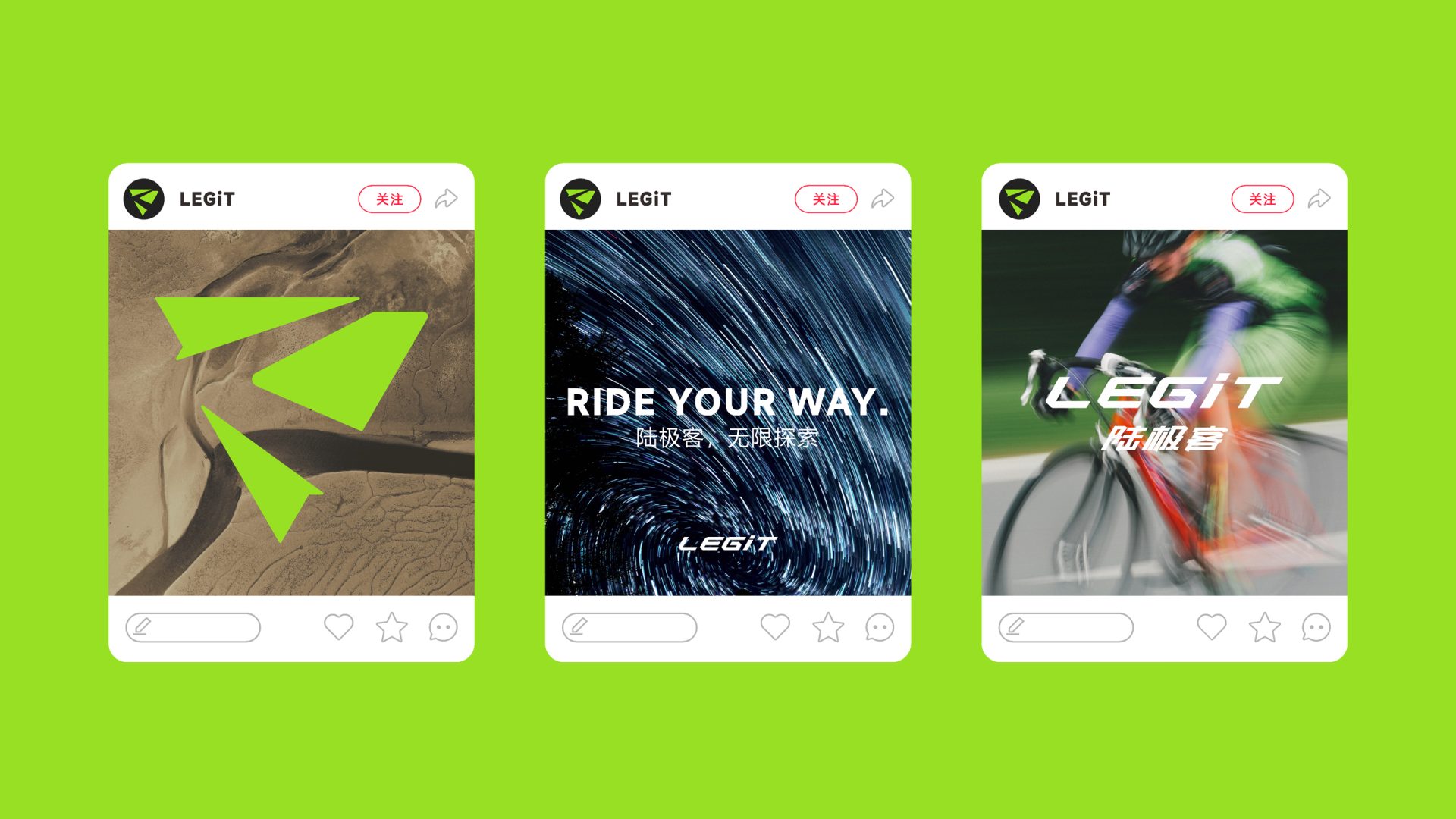
LEGiT陆极客
DESIGNER: ALOO
YEAR: 2024
CLIENT: LEGiT
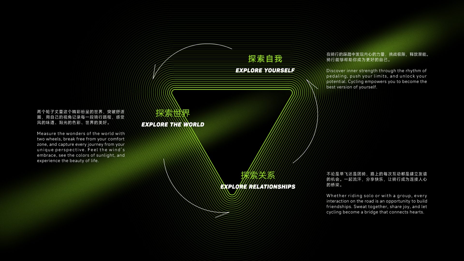
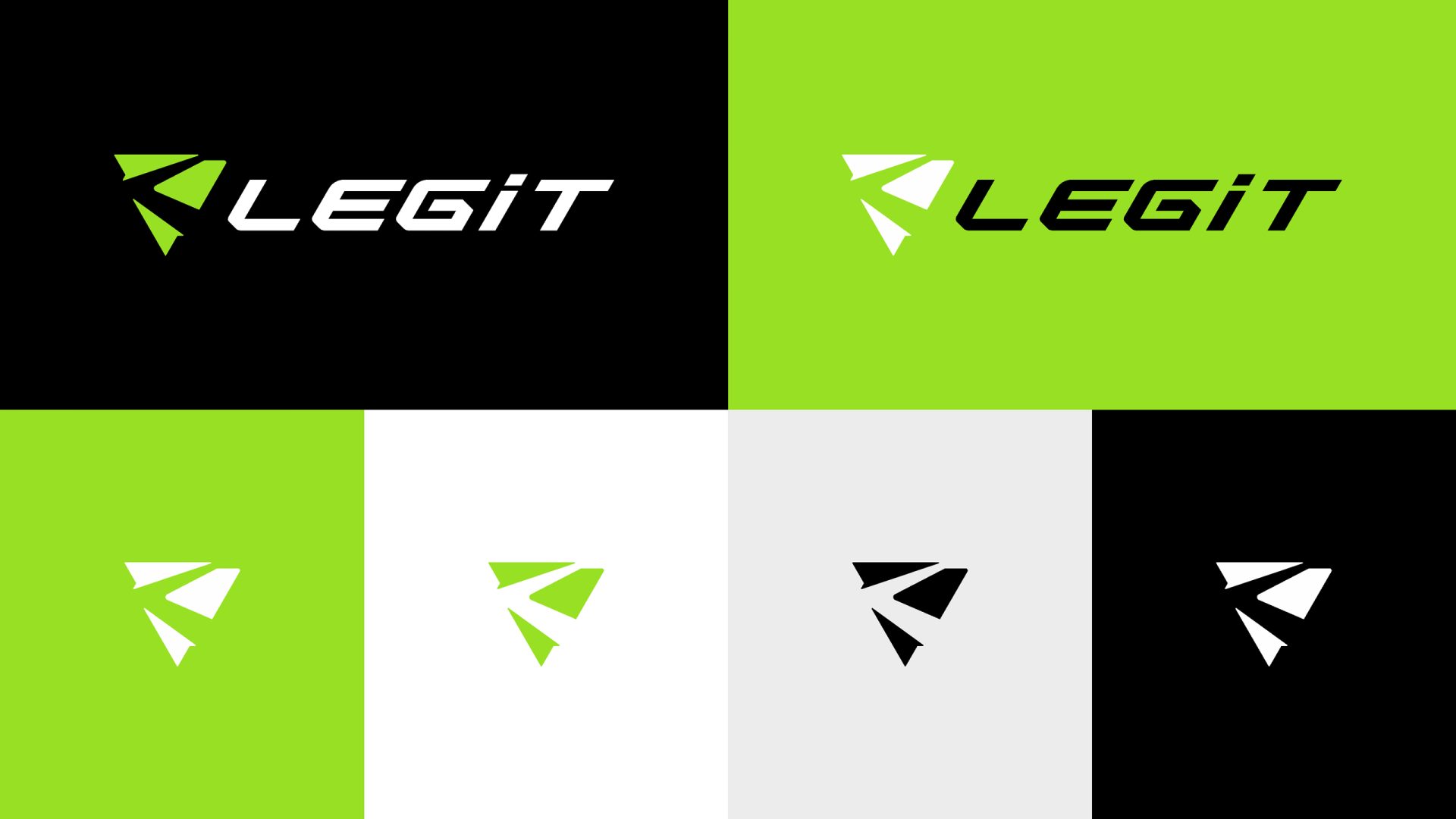
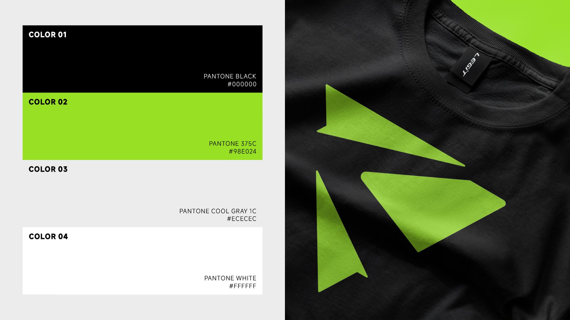
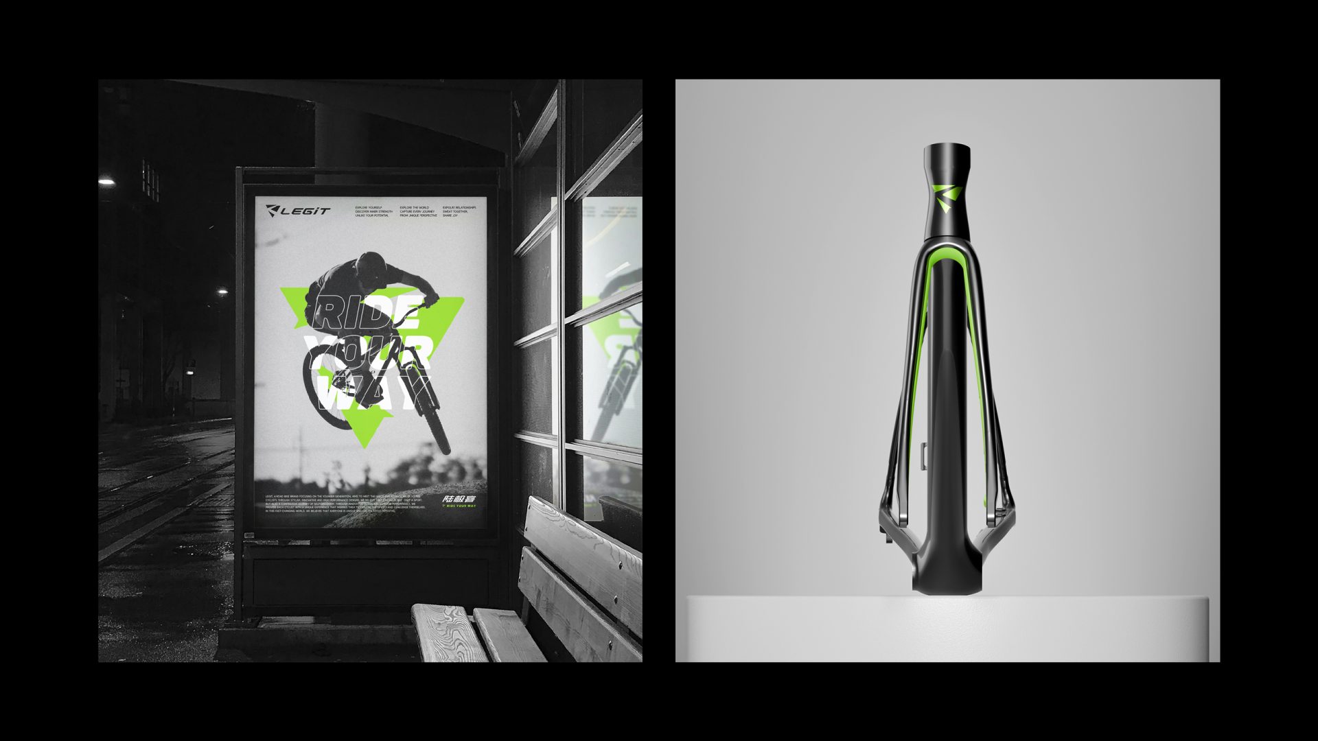
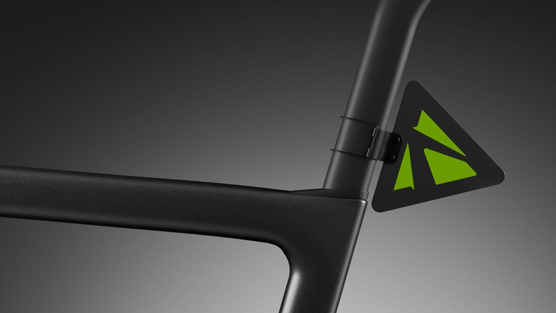
LEGIT,专为年轻一代打造的公路车品牌。品牌围绕年轻骑行者的需求展开,展现他们对高性能、未来感和自我表达的热情。LOGO的超级符号源自三角形的演变,象征一条无限探索的道路,也蕴含了骑行中的速度、动感与突破,这些不仅带给骑行者身体上的愉悦,更激发骑行者在探索自我、探索世界与建立关系的过程中获得精神上的共鸣,达成身心的完美共振,让骑行的体验更加释放。品牌选择鲜亮的嫩绿色,象征活力与锋芒,传递出现代感与未来感,正符合年轻一代对个性和自我表达的强烈追求。LEGIT鼓励每位骑行者在自由与探索的旅程中,找到属于自己的骑行方式,勇敢前行、突破边界,去追寻无尽的可能性。
LEGIT is a road bike brand designed specifically for the younger generation. The brand focuses on the needs of young cyclists, showcasing their passion for high performance, futurism, and self-expression. The logo’s iconic symbol originates from the evolution of the triangle, representing an endless journey of exploration. It embodies the speed, dynamism, and breakthrough of cycling, which not only brings physical pleasure to cyclists but also inspires them to find spiritual resonance while exploring themselves, the world, and building connections. This creates a perfect synergy of mind and body, making the cycling experience more liberating.
The brand chooses a vibrant, fresh green color, symbolizing vitality and sharpness, conveying a sense of modernity and futurism that aligns with the younger generation’s strong pursuit of individuality and self-expression. LEGIT encourages every cyclist to find their own way of riding on a journey of freedom and exploration, daring to move forward, break boundaries, and chase endless possibilities.